Color Psychology in Entryway Storage: Using Hues to Make Small Spaces Feel Bigger
Discover how color psychology transforms small entryways. Learn to use hue, saturation, and storage placement to create the illusion of expansive space.
Feb 3, 2026 - Written by: linda wise

The entryway is the handshake of the home. It is the transitional threshold that sets the psychological tone for the rest of the living space. However, for many urban dwellers and homeowners, this critical area is often the most spatially challenged. When square footage is at a premium, the accumulation of coats, shoes, and mail can quickly turn a welcoming foyer into a claustrophobic bottleneck. While physical decluttering is essential, there is a powerful, often underutilized tool in the interior design arsenal: color psychology.
Color is not merely an aesthetic overlay; it is a manipulator of perception. The right chromatic choices applied to your storage solutions can dissolve visual boundaries, trick the eye into perceiving depth, and transform a cramped vestibule into an airy, expansive gateway. By understanding the interplay between Light Reflectance Value (LRV), saturation, and visual weight, you can curate storage units that serve their functional purpose while simultaneously expanding the perceived volume of the room.
This comprehensive guide explores the strategic application of color theory specifically regarding entryway storage, offering sophisticated solutions for making small spaces feel significantly larger.
The Science of Visual Weight and Spatial Perception
To master the art of expanding a small entryway, one must first understand the concept of visual weight. Visual weight refers to how much attention an object demands from the human eye. In a small space, “heavy” objects make the room feel smaller because they dominate the field of vision, creating a sense of overcrowding.
Storage furniture is inherently heavy. A solid wood shoe cabinet or a metal coat rack occupies physical volume. However, by manipulating the color of these items, we can alter their visual weight. Dark, saturated colors (black, navy, mahogany) absorb light and appear heavier and more solid. Light, desaturated colors (white, cream, pale gray) reflect light and appear lighter, almost ephemeral.
Furthermore, color temperature influences depth perception. Warm colors (reds, oranges, yellows) are known as “advancing” colors; they appear to move toward the viewer, which can make a small hallway feel intimate but also smaller. Cool colors (blues, greens, violets) are “receding” colors; they appear to move away from the viewer, visually pushing the walls back and creating the illusion of expanded space.
The Monochromatic Camouflage Technique
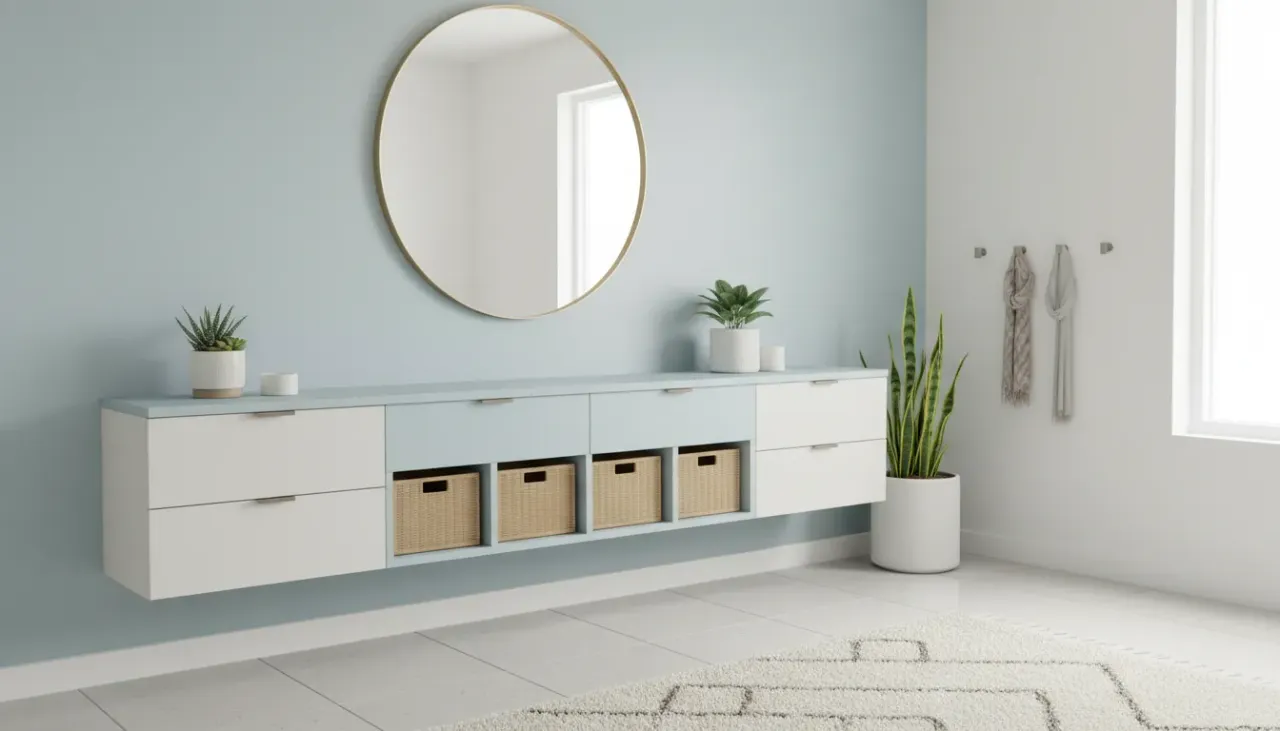
One of the most effective strategies for mitigating the bulk of entryway storage is the monochromatic approach, or “camouflaging.” This technique involves matching the color of your storage units—shelves, cabinets, and benches—to the exact shade of the wall behind them.
When a large storage unit contrasts sharply with the wall (for example, a dark walnut cabinet against a white wall), the eye registers a clear boundary. This interruption in the visual plane fragments the space, highlighting exactly how much room the furniture is taking up. Conversely, when the storage unit matches the wall, the boundaries blur. The furniture ceases to be a separate entity and becomes part of the architecture itself.
Executing the Built-In Look
You do not need custom carpentry to achieve a built-in look. By painting a standalone IKEA cabinet or a second-hand console table the same color as your walls, you achieve spatial continuity.
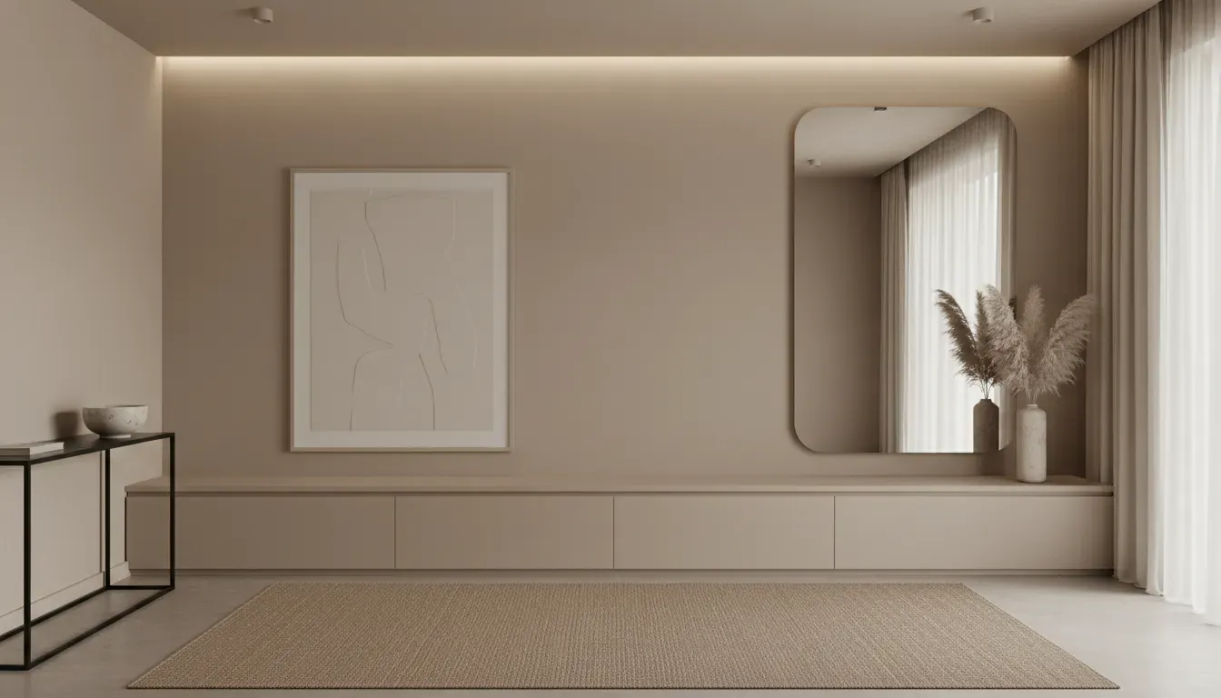
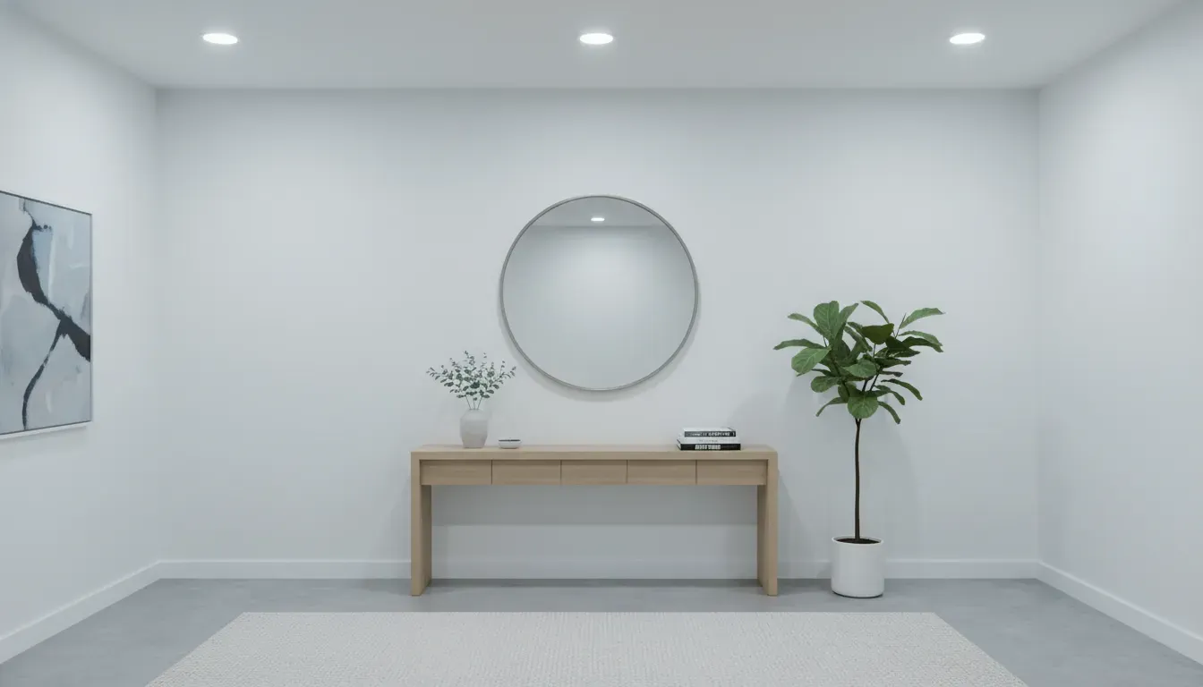
For small entryways, off-whites, soft greiges, and light pastels are ideal. These shades have high Light Reflectance Values (LRV), meaning they bounce natural and artificial light around the room, eliminating shadows that typically congregate in corners and make spaces feel smaller.
If you are looking for a versatile piece to apply this technique to, consider unfinished or paintable furniture that allows for exact color matching.
Check out this paintable wooden shoe cabinet on Amazon
When applying this technique, consider the finish as well as the hue. Using a satin or semi-gloss finish on the storage unit against a matte wall adds a layer of sophisticated texture without breaking the color field. This subtle difference catches the light, adding dimension without visual clutter.
Cool Tones: The Receding Horizon
If a monochromatic white or beige palette feels too sterile, cool tones offer a way to introduce character while maintaining the illusion of space. Psychologically, blues and greens are associated with the sky, the ocean, and the forest—vast, open environments. Bringing these hues into a confined entryway triggers a subconscious association with openness.
The Psychology of Blue and Green Storage
Soft, muted blues and sage greens are particularly effective for entryway storage. A storage bench painted in a dusty blue (like a “Stardew” or “Hale Navy” diluted with white) creates a focal point that is soothing rather than imposing.
Because these colors recede, a console table painted in a cool tone will appear to sit further back against the wall than a red or orange table would. This is crucial in narrow hallways where every inch of perceived width matters.
When selecting storage for this palette, avoid heavy, blocky silhouettes. Instead, opt for pieces with legs that expose the floor underneath. Seeing the floor continue beneath the furniture tricks the brain into estimating the room’s floor area as larger than it is.
For further inspiration on integrating these calming hues, you might explore our guide on Coastal Entryway Ideas, which heavily utilizes receding cool tones to maximize light and space.
High Contrast and Focal Diversion
While blending in is a safe bet for enlargement, there is a counter-intuitive strategy known as focal diversion. In some small entryways, especially those that are irregularly shaped, trying to hide the lack of space is futile. In these instances, the goal shifts from expanding the space to distracting the eye.
By using a single, boldly colored storage piece against a neutral backdrop, you dictate where the viewer looks. A vibrant emerald green coat stand or a deep charcoal shoe cabinet draws the eye immediately. The logic here is simple: if the eye is captivated by a beautiful, saturated object, it spends less time scanning the perimeter of the room and registering the tight confines.
The Anchor Effect
This technique works best when the rest of the room is kept scrupulously minimal. The bold storage unit becomes the “anchor.” For this to be effective, the color must be intentional and sophisticated—think jewel tones or deep earth tones rather than primary colors, which can feel chaotic.
If you choose this route, ensure the storage unit is impeccably organized. A bright yellow shelf that is cluttered with junk will only highlight the mess. The bold color acts as a spotlight; ensure what it illuminates is tidy.
View this navy blue entryway console table on Amazon
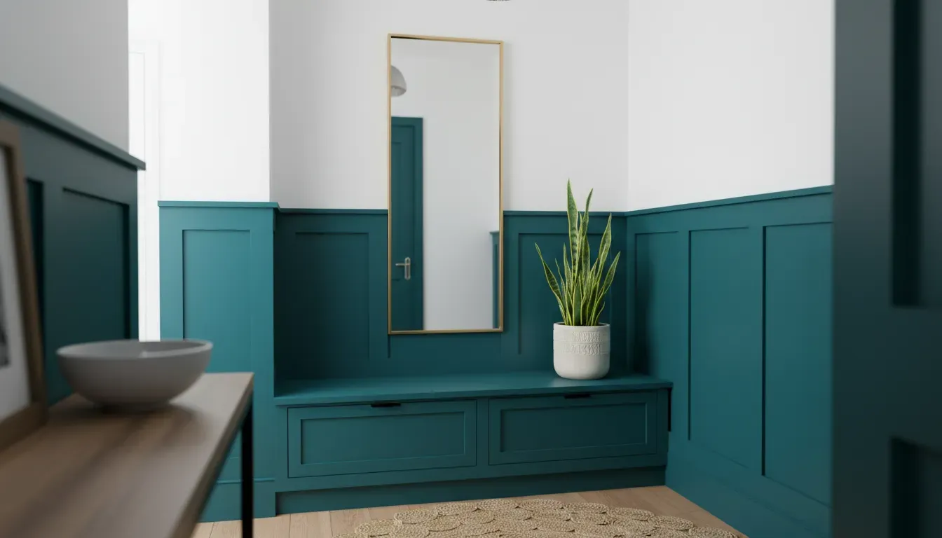
Vertical Color Blocking: Drawing the Eye Upward
Small entryways often suffer from a lack of floor space, but they frequently possess the same ceiling height as the rest of the home. To make the room feel bigger, you must encourage the eye to travel vertically. Color blocking is an exceptional tool for this.
A popular and effective method is painting the lower third of the room (and the storage units within that zone) a darker, grounding color, while keeping the upper two-thirds and the ceiling a bright white.
Why This Works
- Grounding: The darker color at the bottom (perhaps a slate gray or forest green) anchors the space. It hides scuff marks from shoes and bags, which is practical for high-traffic zones.
- Expansion: The lighter upper section merges with the ceiling, blurring the line where the wall ends and the ceiling begins. This makes the ceiling feel higher, creating a sense of volume.
If you have a shoe bench or a low console, painting it to match the lower color block allows it to recede, while floating shelves placed in the upper white zone should be white (or light wood) to maintain the airy feeling above.
Materiality as Color: The Role of Transparency and Wood Tones
Color psychology is not limited to paint; it extends to the natural colors of materials. In the quest to maximize space, two materials reign supreme: acrylic (lucite) and light woods.
The Invisible Storage
Acrylic or glass furniture is the ultimate weapon for small spaces because it possesses zero visual weight. A clear acrylic console table provides a surface for keys and mail but allows light to pass directly through it. The eye sees the wall behind the table and the floor beneath it without interruption.
While strictly speaking, this is the absence of color, it functions on the same principle of reducing visual fragmentation. If you have a patterned wallpaper or a beautiful paint color you want to show off, acrylic storage allows that color to sing without obstruction.
Discover acrylic console tables on Amazon
Scandinavian Light Woods
If transparency feels too modern or cold, light wood tones (birch, ash, white oak) offer a warm alternative that still maintains spaciousness. Dark woods (walnut, mahogany, wenge) absorb light and create high-contrast silhouettes that can dominate a small room. Light woods reflect light and blend harmoniously with white or pastel walls, maintaining the “receding” effect while adding organic texture.
The Interaction of Lighting and Color
The color of your storage will only be as effective as the lighting that illuminates it. A “receding” cool blue can turn muddy and gray in poor lighting, making the space feel cave-like rather than expansive.
Kelvin Temperature
Pay attention to the Kelvin temperature of your entryway bulbs.
- 2700K (Warm White): Enhances wood tones and reds but can make white storage look yellow.
- 3000K (Soft White): A neutral middle ground.
- 4000K-5000K (Daylight): Enhances blues and cool tones, making the space feel crisp and alert. This is often best for modern, minimalist entryways aiming for maximum perceived size.
If your entryway lacks natural light, glossy finishes on your storage units can act as light multipliers. A high-gloss white lacquer shoe cabinet will reflect the overhead light, essentially acting as a mirror and brightening the dark corners of the hall.
For those undertaking a complete renovation, reviewing our DIY Entryway Makeover Tips can provide guidance on lighting installation alongside storage solutions.
Practical Application: A Step-by-Step Selection Guide
When choosing the color palette for your entryway storage, follow this strategic workflow to ensure the result maximizes space.
1. Assess the Natural Light
Stand in your entryway at different times of the day. If the space is windowless or North-facing, avoid dark, light-absorbing colors for your large storage pieces. Stick to high LRV colors (whites, creams, pale grays). If you have abundant South-facing light, you have more flexibility to use cool, medium-tone blues without shrinking the room.
2. Determine the Scale of Storage
How big is the unit relative to the wall?
- Wall-to-wall units: These should almost always match the wall color to prevent the “closing in” effect.
- Small accent pieces: These can handle contrast or bold colors as they function as decor rather than architecture.
3. Coordinate with Flooring
The floor is the second largest surface in the room. If you have dark hardwood floors, a dark storage bench will blend into the floor (reducing visual weight). If you have light tile, a light unit will achieve the same seamlessness. This “ground-up” blending is a variation of the monochromatic technique.
4. The 60-30-10 Rule
Apply this classic design rule to maintain balance:
- 60% Main Color: Usually the walls and large storage units (keep this light/neutral).
- 30% Secondary Color: Flooring or a rug.
- 10% Accent Color: Knobs, hooks, or a small decorative tray (this is where you can add black or bright colors for definition).
Conclusion: Functionality Meets Perception
Transforming a small entryway does not always require knocking down walls. By harnessing the principles of color psychology, you can manipulate the perception of space, turning a cramped corridor into a welcoming, breathable foyer.
Whether you choose the seamless invisibility of monochromatic “camouflaging,” the depth-enhancing properties of cool tones, or the airy transparency of acrylics, the goal remains the same: to reduce visual friction. Storage is a necessity, but it need not be a visual burden. By carefully selecting the hue, saturation, and finish of your entryway furniture, you elevate storage from a mere receptacle for shoes to an integral element of spatial architecture.
The entryway sets the expectation for the home. Make yours feel limitless.