How to Use Entryway Hooks as Decorative Wall Art (Even When They’re Empty)
Discover how to transform utilitarian hardware into sculptural masterpieces. We explore layout strategies, material selection, and the art of the 'naked' hook.
Feb 10, 2026 - Written by: Linda Wise

Walk into the average home, and the entryway usually tells one of two stories: it’s either a chaotic explosion of coats and backpacks, or it’s a barren, utilitarian pass-through that feels cold and uninvited. We tend to treat entryways as transition zones rather than destinations. But here is the reality: your entryway is the handshake of your home. It sets the emotional baseline for everything that follows.
For years, I’ve watched clients struggle with the “coat rack dilemma.” Standing coat racks eat up precious floor space, while standard wall hooks often look like sad, industrial pimples when nothing is hanging on them.
This is where the paradigm shifts.
The secret isn’t just finding a place to dump your keys. It’s about selecting and arranging hooks so they function as sculptural wall art first, and utility second. When the coats are gone—which, let’s be honest, is a significant portion of the day—your wall shouldn’t look like it’s missing something. It should look intentional. It should look curated.
We are going to dismantle the idea of the hardware store hook and rebuild your entryway using principles of rhythm, negative space, and materiality.
The Philosophy of Sculptural Utility
To pull this off, you have to stop thinking about hooks as hardware. In the design world, we call this “sculptural utility.” It’s the intersection where an object’s form is so compelling that its function becomes secondary to its aesthetic value.
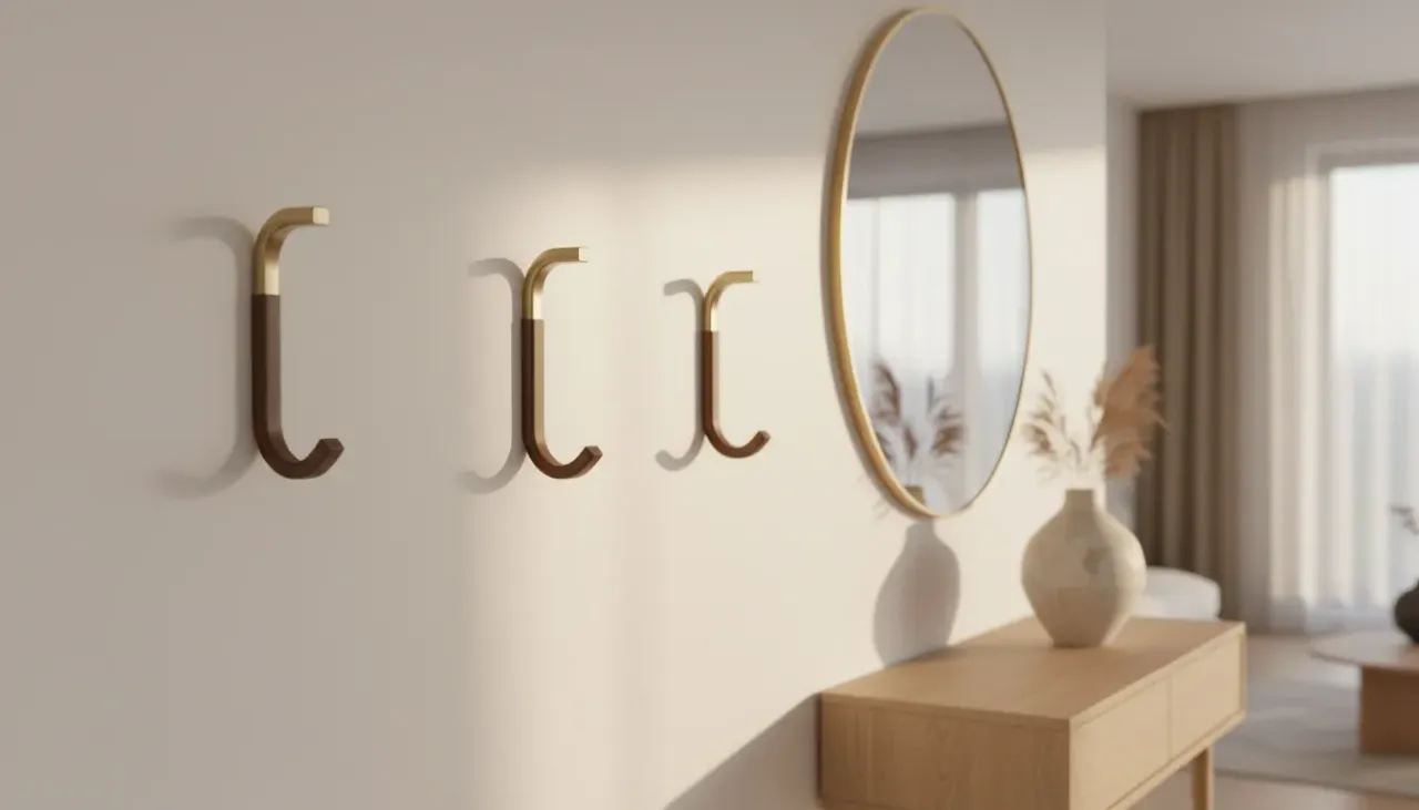
Think about a standard metal J-hook. It screams “utility.” Now, visualize a turned walnut sphere mounted directly to the wall. Even without a scarf draped over it, that walnut sphere reads as texture. It reads as a geometric punctuation mark on a blank canvas.
The “Naked” Test
Before you drill a single hole, every hook you consider must pass what I call the “Naked Test.” Ask yourself: If I never hang a single item on this, does it still deserve to be on my wall?
If the answer is no, put it back on the shelf. If the answer is yes, you’re ready to build an installation.
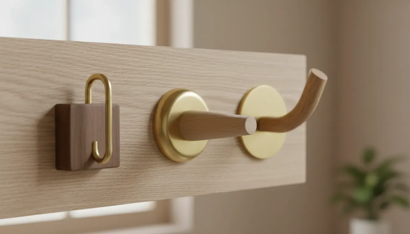
Pro Tip: When shopping, look for hooks described as “knobs,” “pulls,” or “wall dots.” Often, hardware marketed for cabinetry can be repurposed as wall hooks if you use double-ended dowel screws. This opens up a world of marble, brass, and agate options that aren’t available in the standard “organization” aisle.
Materiality and Texture: Choosing Your Medium
The difference between a locker room and a gallery wall lies entirely in the materials you choose. Because we are treating this as art, the tactile experience matters. You want materials that catch the light, create shadows, or add warmth.
1. The Warmth of Wood
Wood is the great neutralizer. It softens the hard lines of door frames and tile floors. However, avoid the cheap, varnished pine often found in big-box stores. Look for woods with deep grain or interesting turning.
Oak, walnut, and ash are excellent choices. The grain patterns act as micro-artworks. When you arrange wooden dots of varying sizes, you create a constellation that feels organic rather than rigid.
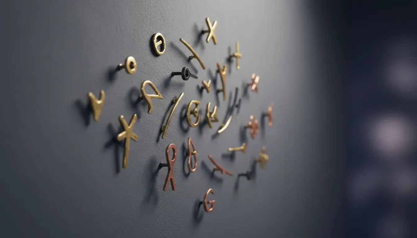
2. The Drama of Metal
If you want your wall to pop, metal is your best friend. But be careful—chrome can feel too commercial. Brushed brass, blackened steel, or copper develop a patina over time that adds character.
I’ve personally found that mixing metals is risky in a small entryway unless you really know what you’re doing. Sticking to a single metal finish creates a cohesive “installation” vibe. Matte black hooks against a white wall create a high-contrast, graphic look that is incredibly modern.
3. Ceramics and Stone
This is the frontier of entryway design. Hooks made from terrazzo, marble, or glazed ceramic introduce unexpected texture. They feel more like jewelry for your home than storage. A heavy marble hook has “visual weight,” meaning it commands attention and anchors the space.
Composition Strategies: Breaking the Linear Mold
Here is where most people fail. They buy nice hooks, and then they screw them into the wall in a straight, horizontal line, 60 inches from the floor.
Don’t do this.
A straight line screams “coat rack.” To achieve the art gallery effect, you need to disrupt the expected pattern. You need to play with layout.
The Constellation Method
This is my absolute favorite technique for families. Instead of a line, you scatter hooks at varying heights and lateral distances.
- Why it works: It looks like a deliberate art piece, similar to a bubble diagram or a constellation of stars.
- The Utility Bonus: It provides reachable hooks for kids (low) and longer hanging space for trench coats or umbrellas (high).
- Execution: Use hooks of different sizes (small, medium, large). Keep the spacing irregular but balanced.
If you want the best experience creating this look, I highly recommend checking out the Muuto The Dots Wall Hooks. They are the archetype for this style—beautifully turned wood that looks stunning when bare.
The Architectural Grid
If your home leans towards minimalism or mid-century modern, the organic constellation might feel too chaotic. Enter the Grid.
Place identical hooks in a perfect square or rectangular array (e.g., 3x3 or 2x4). The repetition creates a sense of order and calm. When empty, it looks like a minimalist sculpture installation.
- The Math: Precision is non-negotiable here. Use a laser level. If one hook is off by a quarter-inch, the illusion breaks.
- Visual Weight: This works best with geometric hooks—cubes or perfect cylinders.
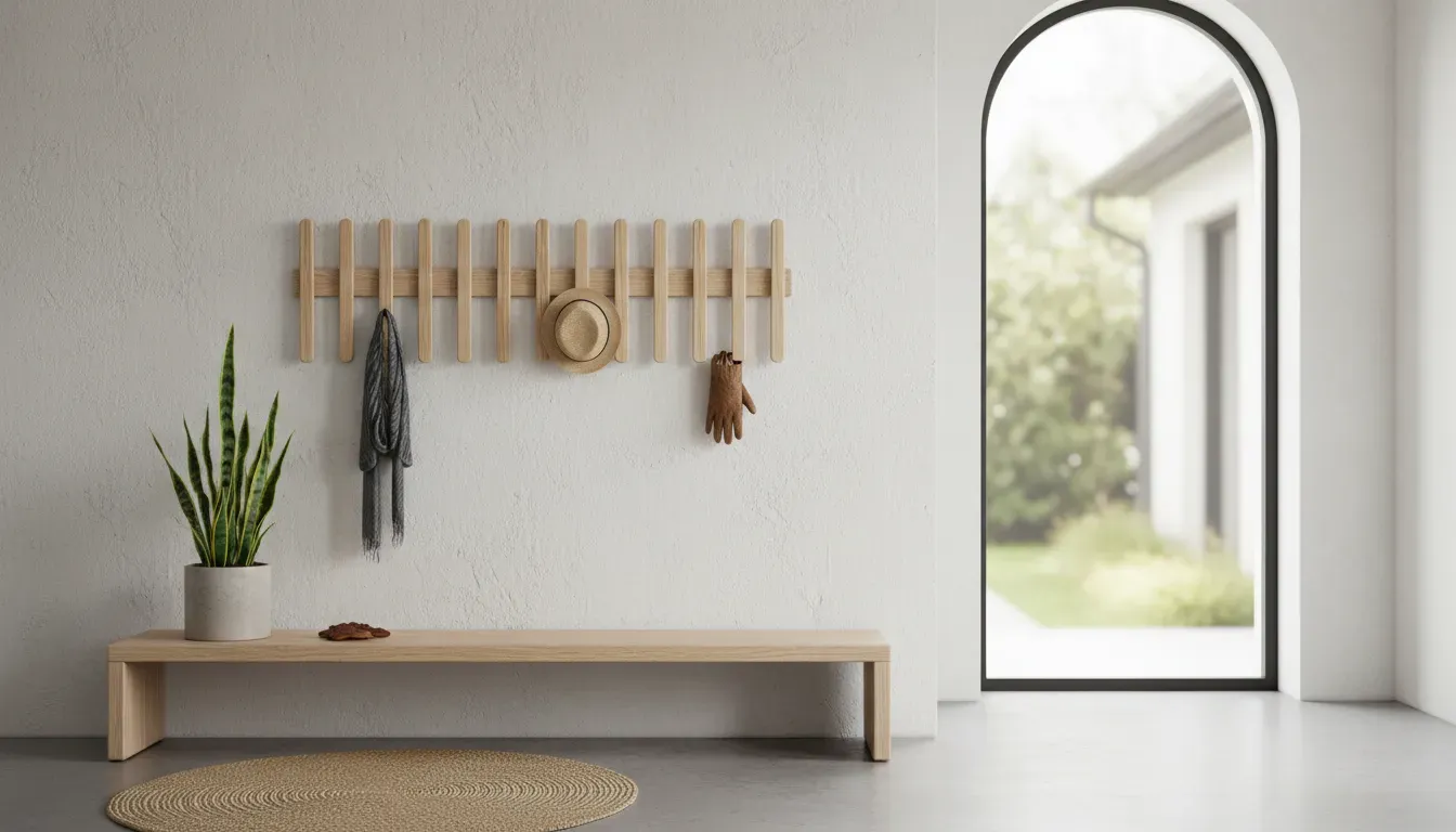
The Linear Fold (Retractable Art)
Sometimes, space is so tight that even a protruding hook is a hazard. In these narrow hallways, retractable hooks are a lifesaver. These units look like a piece of abstract wall art (often resembling a skyline or a picket fence) when closed. You only flip down a hook when you need it.
For this application, the Umbra Picket Rail Hook is a standout. It looks like a sculptural wood relief when not in use, completely disguising its function.
Installation: The Technical Art of “Breathing Room”
You have your hooks, and you have your layout idea. Now let’s talk about negative space. In graphic design, negative space is the empty area around the subject. In your entryway, it’s the wall space between hooks.
If you crowd your hooks, you lose the “art” factor. Clutter kills elegance.
The 12-Inch Rule
As a general baseline, I try to keep at least 12 inches of radial clearance around “statement” hooks. This allows the object to breathe. It casts a shadow. It lets the eye rest.
If you are doing a tight grid, you can go closer, perhaps 6 to 8 inches, but consistency becomes your god.
Anchoring is Everything
Nothing ruins the aesthetic of a sculptural hook faster than it sagging or ripping out of the drywall. Because we are prioritizing aesthetics, we often choose hooks that are heavy or have unusual mounting plates.
- Drywall is the enemy. Always try to hit a stud.
- Toggle Bolts are your best friend. If you can’t hit a stud, do not use those cheap plastic plugs. Use toggle bolts or heavy-duty screw-in anchors (like E-Z Ancors). A hook that acts as art needs to sit flush and firm against the wall.
Advanced Styling: Curating the “Empty” Wall
We’ve talked about the hooks themselves, but context is king. You can elevate the hooks by manipulating the environment around them.
Paint Blocking
This is a high-impact, low-cost trick. Paint a geometric shape (an arch, a circle, or a wide color-block band) on the wall behind where the hooks will go.
This frames the hooks. It tells the viewer, “Look here, this is a designated zone.” A terracotta arch behind three brass hooks transforms a white hallway into a Mediterranean vignette.
Lighting the Sculpture
Art galleries use lighting to make pieces pop. You should too. If you have the wiring for it, a wall sconce placed above your hook arrangement creates dramatic shadows that emphasize the shape of the hooks.
If hardwiring isn’t an option, consider a small, battery-operated picture light or simply positioning the hooks where they catch the wash from a nearby table lamp.
The “Permanent” Resident
Here is a counter-intuitive thought: to make hooks look like art, leave one thing hanging on them permanently.
Not a dirty raincoat. I’m talking about a prop.
- A dried bundle of lavender.
- A woven market bag with texture.
- A wooden bead garland.
This bridges the gap between the naked hook and the cluttered coat rack. It suggests habitation without the mess.
Pro Tip: If you have a radiator or a console table below your hooks, ensure the lowest hook is high enough that a long coat won’t drape over the furniture. That visual collision creates subconscious stress.
Troubleshooting Common Pitfalls
I’ve seen many well-intentioned DIY projects go sideways. Here are the traps to avoid.
1. The “Too High” Syndrome People tend to hang art at eye level (approx. 57 inches). But for coat hooks, especially if you want them to look like art, you often need to go slightly higher or significantly lower depending on the composition. If you hang them too high, they look disconnected from the rest of the room’s furniture.
2. The Tiny Hook Mistake Small hooks disappear. If you want decorative impact, scale up. Oversized hooks are playful and confident. Tiny hooks look apologetic.
3. Ignoring the Shadow Some hooks project far off the wall; others are shallow. Deep hooks cast long shadows which can be visually interesting, but they can also encroach on walking space. In a narrow hall, a deep hook at eye level is a hazard.
Product Spotlight: The Icons
We’ve touched on a few, but there are certain designs that have stood the test of time because they perfectly balance this art/utility equation.
If you want a piece that acts as a singular, large-scale art installation, nothing beats the playful architecture of the Eames Hang-It-All. Originally designed in 1953, it uses colorful wooden spheres on a wire frame. It’s iconic. It’s practically a piece of modern art history that you can buy on Amazon. It solves the “layout” problem for you because the composition is pre-set.
The Bottom Line
Transforming your entryway doesn’t require a contractor or a massive budget. It requires a shift in perspective. You have to stop seeing hooks as hardware store necessities and start seeing them as opportunities for expression.
Key Takeaways:
- Audit the Form: If it doesn’t look good naked, don’t buy it.
- Break the Line: Avoid the horizontal row. Use constellations or grids.
- Mind the Gap: Give each hook breathing room to function as a visual object.
- Mix Materials: Use wood, stone, and metal to add texture to flat walls.
When you treat your entryway hooks as decorative wall art, you solve the clutter problem, but you also gain something more important: a sense of arrival. You create a space that greets you with intentionality every time you walk through the door. The empty hook is no longer a void; it’s a pause. And in our busy lives, that visual pause is everything.