Ergonomic Design: Ensuring Smooth Traffic Flow Around Built-In Entryway Organization
Master the spatial dynamics of your foyer. Discover expert strategies for integrating built-in organization without sacrificing traffic flow or human comfort.
Mar 10, 2026 - Written by: Linda Wise
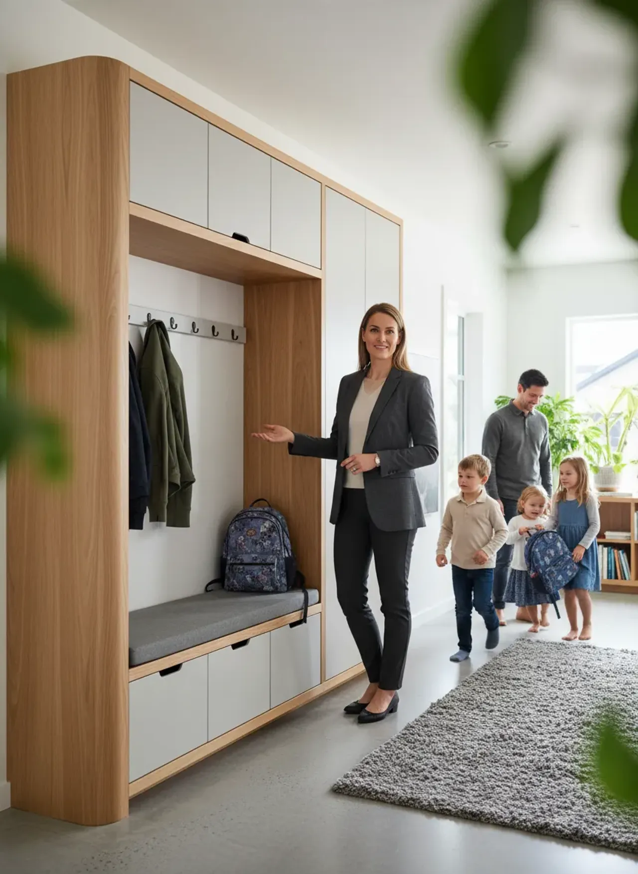
You unlock the front door, step inside with a loaded grocery bag cutting off circulation to your fingers, and immediately trip over a stray boot. Frustrating, isn’t it? The foyer is the architectural handshake of your home. When that space is choked by oversized cabinetry, poorly placed benches, and haphazard drop zones, the resulting physical friction creates a baseline level of stress before you even take your coat off.
I’ve personally found that the fundamental difference between a chaotic mudroom and a serene, highly functional entrance isn’t the aesthetic appeal of the millwork. It all comes down to residential ergonomics. Designing for the human body in motion requires a meticulous understanding of how we navigate transitional spaces. We must account for the spatial envelope required to bend, twist, reach, and pivot without feeling boxed in.
Before diving into the granular mathematics of spatial planning and dynamic clearance, here is a curated selection of hardware and furnishings engineered to maximize utility without encroaching on your valuable floor space.
Quick Comparison: Top Picks
| Product | Rating | Check Price |
|---|---|---|
| Heavy-Duty Retractable Coat Hooks | ⭐⭐⭐⭐⭐ | View on Amazon |
| Ultra-Slim Tilting Shoe Cabinet | ⭐⭐⭐⭐½ | View on Amazon |
| Radius-Edge Entryway Storage Bench | ⭐⭐⭐⭐⭐ | View on Amazon |
The Kinematics of the Foyer: Why Ergonomics Matter
When we talk about built-in entryway organization, the conversation usually leans heavily toward storage capacity. How many coats can it hold? Will it hide the winter boots? But this hyper-focus on volume completely neglects the kinematics of human movement. Kinematics—the geometry of motion—dictates that a stationary human requires significantly less space than a human actively shedding the layers of the outside world.
Think about the physical choreography of entering a house. You step through the threshold. You pivot to push the door shut. You shift your weight to one leg to pry off a shoe, perhaps leaning against a wall or bending at the waist. Your elbows flare outward as you shrug off a heavy winter coat. Every single one of these actions expands your physical footprint. If your built-in organization restricts this dynamic envelope, you’ve created an architectural bottleneck.
To prevent this, the built-in elements must respect the “active zone” of the entryway. This is the invisible boundary where high-friction activities occur. Placing a rigid, 24-inch deep wardrobe directly inside the door swing immediately compromises the active zone. Instead, the architecture should guide the occupant deeper into the home, offering an unobstructed path that naturally widens into a designated drop area.
Analyzing Foot Traffic: The ‘Drop Zone’ Dynamics
Human beings are creatures of staggering predictability. We follow the path of least resistance. If the designated coat hook requires walking past the kitchen, the coat will inevitably end up draped over a dining chair. Understanding this behavioral vector is paramount when conceptualizing your organizational layout.
The drop zone is not a single point in space; it is a chronological sequence of actions. Keys and mail are usually discarded first. Coats follow shortly after. Shoes are generally the final layer to be removed. If your built-ins force you to execute this sequence out of order—for example, placing the shoe cubbies right at the threshold but forcing you to walk ten feet further to hang your keys—you disrupt the natural flow. This forces you to backtrack, cross your own path, and collide with anyone walking in behind you.
When you are optimizing the layout of a small foyer, this sequential alignment becomes critical. The built-in should unfold like a narrative as you walk inward: a shallow catch-all ledge for keys immediately adjacent to the door frame, followed by coat storage, culminating in a deeper seating area for shoe removal. This linear progression prevents lateral traffic jams and keeps the primary artery of the hallway entirely clear.
Clearances and Anthropometrics
You cannot rely on guesswork when defining traffic flow. Anthropometrics, the comparative study of human body measurements, provides the strict mathematical parameters we need to sculpt frictionless spaces.
Here is the real kicker: most homeowners mistakenly use standard hallway dimensions (typically 36 inches wide) as their baseline for entryway flow. A 36-inch clearance is adequate for transit—walking from point A to point B. It is entirely inadequate for the complex biomechanics of an entryway.
To comfortably bend over and untie a shoe without your backside hitting the opposite wall or a passing family member, you need a minimum of 48 inches of clearance between the front edge of your built-in bench and the opposing boundary. If your foyer serves as a primary hub where multiple people arrive simultaneously (like kids returning from school), you should aim for a 60-inch clearing radius.
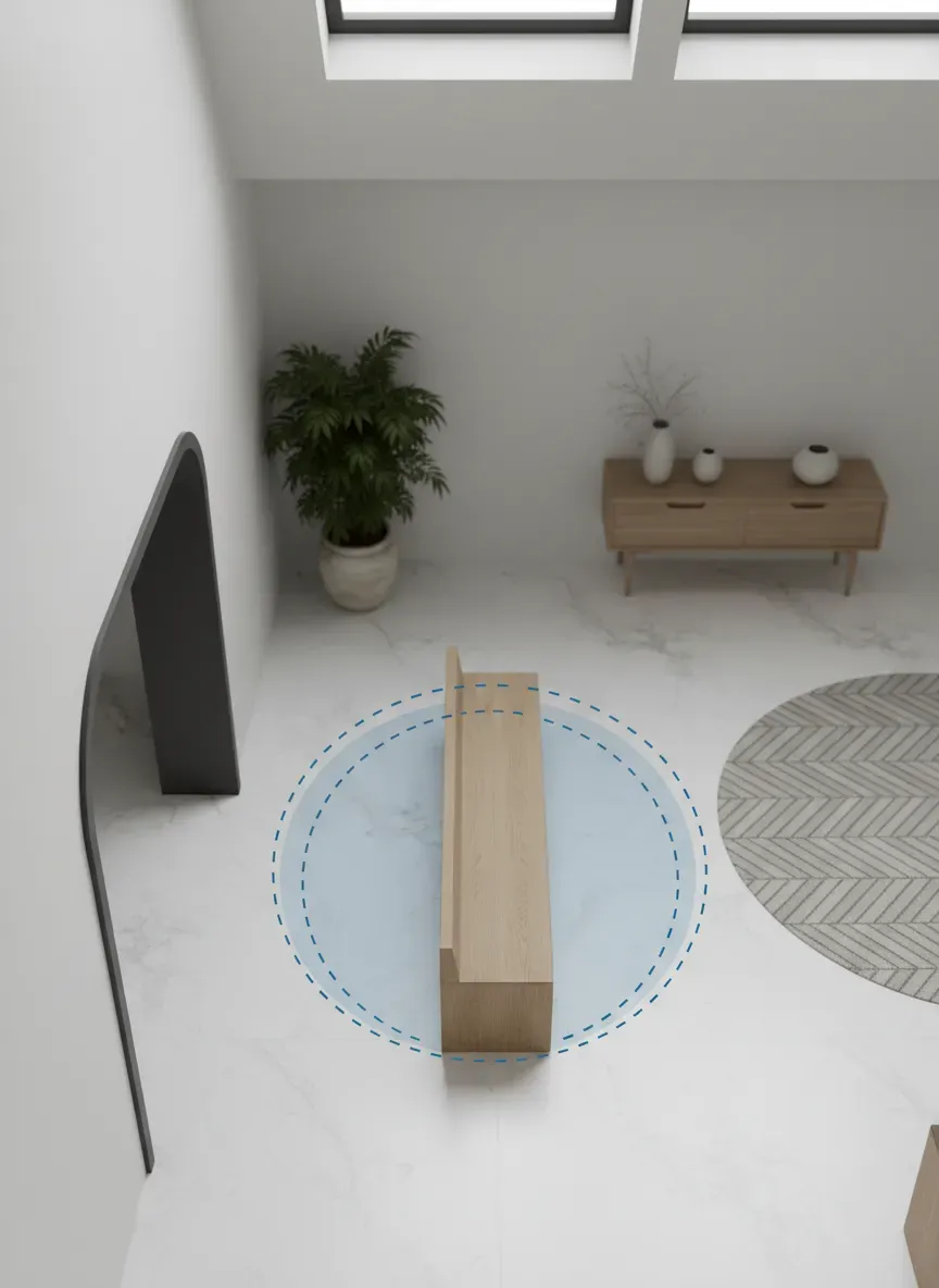
Furthermore, we must account for the “door clash” zone. The area immediately swept by the inward swing of the front door must remain entirely devoid of protruding millwork. If someone is standing at the built-in bench, the door should be able to open fully without striking them. This requires visualizing the invisible arcs of movement not just of the people, but of the architecture itself.
Designing the Built-Ins for Frictionless Movement
Now that we understand the invisible geometry of the room, we can manipulate the physical mass of the built-ins. The goal is to maximize storage volume while minimizing the visual and physical footprint.
Recessing the built-ins is the gold standard of ergonomic foyer design. If you have the structural capacity to steal 12 to 18 inches from an adjacent room or a deep wall cavity, you can push the entire organizational unit flush with the hallway wall. This completely preserves the original width of the traffic artery.
When recessing isn’t a viable option due to load-bearing constraints or plumbing stacks, we must rely on stepped depth profiles. A monolithic built-in that protrudes 20 inches from the wall creates an imposing, heavy mass that psychologically and physically crowds the occupant. Instead, vary the depth based on function.
Pro Tip: Not all storage needs to be deep. Coats hung on a traditional perpendicular hanger require 24 inches of depth. However, coats hung flat against the wall on pegs only require about 4 inches. By utilizing peg rails for outerwear, you can dramatically slim down the profile of your millwork.
Shoe storage is another notorious space-hog. Standard shelves require roughly 12 to 14 inches of depth to accommodate adult footwear. If your hallway is narrow, this protrusion is unacceptable. The ergonomic workaround is to pitch the storage. Implementing ultra-slim multi-functional shoe storage solutions that hold footwear vertically on a 45-degree tilt can reduce the necessary depth to a mere 6 or 7 inches. This reclaims half a foot of vital walking space while still keeping trip hazards off the floor.
Bench Seating: Height, Depth, and Proximity
The bench is the focal point of the drop zone, but it is frequently miscalculated. A bench that is too low forces the user to strain their knees when standing back up; a bench that is too high causes the feet to dangle, destabilizing the user while they yank off stubborn winter boots.
The ergonomically optimal height for an entryway bench is between 17 and 19 inches off the finished floor. This aligns with standard chair heights and accommodates the natural bend of the adult knee. But height is only half the equation. Depth is where traffic flow is won or lost.
A depth of 15 inches is the sweet spot. It provides ample surface area for the glutes to rest comfortably without jutting out excessively into the walking path. Anything deeper than 18 inches encourages people to dump backpacks and mail behind them on the bench, rendering the seating unusable and defeating its primary purpose.
Notice how top-tier designers always leave a recessed “toe kick” or an open gap beneath the seating. This isn’t just an aesthetic choice to make the millwork look airy. When you stand up from a seated position, your heels naturally tuck backward past your knees to establish a center of gravity. If the front of the bench drops straight down to the floor in a solid block of wood, your heels strike the barrier, forcing an awkward, forward-leaning standing motion. An open base allows for a fluid, anatomically correct transition from sitting to standing.
The Vertical Plane: Hooks, Cubbies, and Shelving
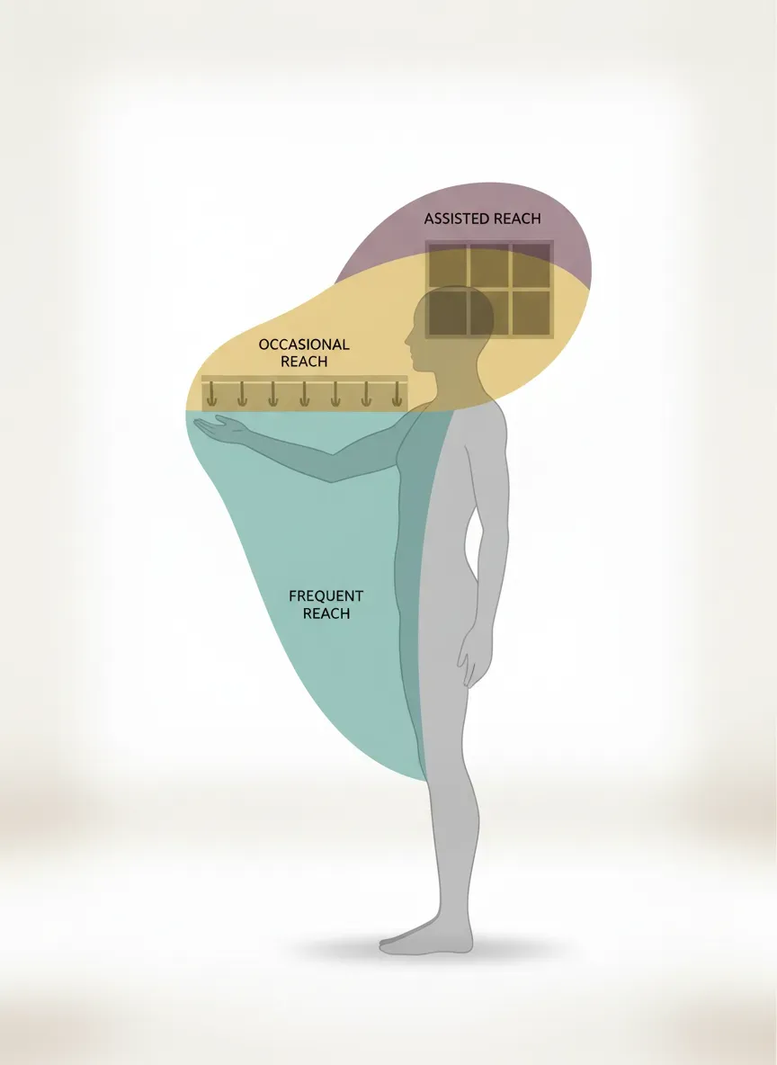
Traffic flow isn’t just about the floor plan; it’s about eye level and reach zones. Ergonomic design maps storage to the natural vertical reach of the human body to prevent straining, stretching, or the necessity of stepping stools—all of which slow down the pace of entry and cause hallway congestion.
We categorize vertical space into three ergonomic tiers:
- The Primary Reach Zone (30 to 60 inches from the floor): This is the prime real estate. It requires no bending and no extreme stretching. Frequently used items—daily jackets, keys, dog leashes, and purses—belong here.
- The Secondary Reach Zone (15 to 30 inches, and 60 to 72 inches): This requires slight bending or a moderate upward reach. Shoe cubbies, hats, and secondary bags go here.
- The Tertiary Zone (below 15 inches, above 72 inches): This requires severe bending, squatting, or the use of a step stool. Reserve these extremities for out-of-season gear.
If you have children, layering the primary reach zone is vital. Installing a secondary, lower rail of heavy-duty hooks at roughly 36 inches high empowers kids to hang their own coats without requiring an adult to stop in the middle of the hallway to assist them. This concept of universal design ensures the space flows smoothly regardless of the user’s stature or physical ability.
Navigating Tight Quarters: Overcoming Spatial Constraints
Not every home is blessed with a grand, sweeping foyer. Many urban dwellings and older homes force the entryway into a cramped micro-hallway or a tiny bump-out. When square footage is violently restricted, the margin for ergonomic error drops to zero.
If you find yourself crafting a highly functional 5x6 mudroom, you must become ruthless with your spatial editing. In these microscopic environments, the built-in cannot afford to be a static object; it must be highly adaptive.
Retractable hardware is an incredible asset here. Fold-down seating that mounts flush against the wall when not in use reclaims the entire hallway for passage. Once the door is closed and the traffic has thinned, the bench can be deployed for shoe removal. Similarly, spring-loaded hooks that snap back into a recessed channel ensure you won’t snag a sweater or scrape a shoulder when rushing past.
Corner Optimization and Radius Edges
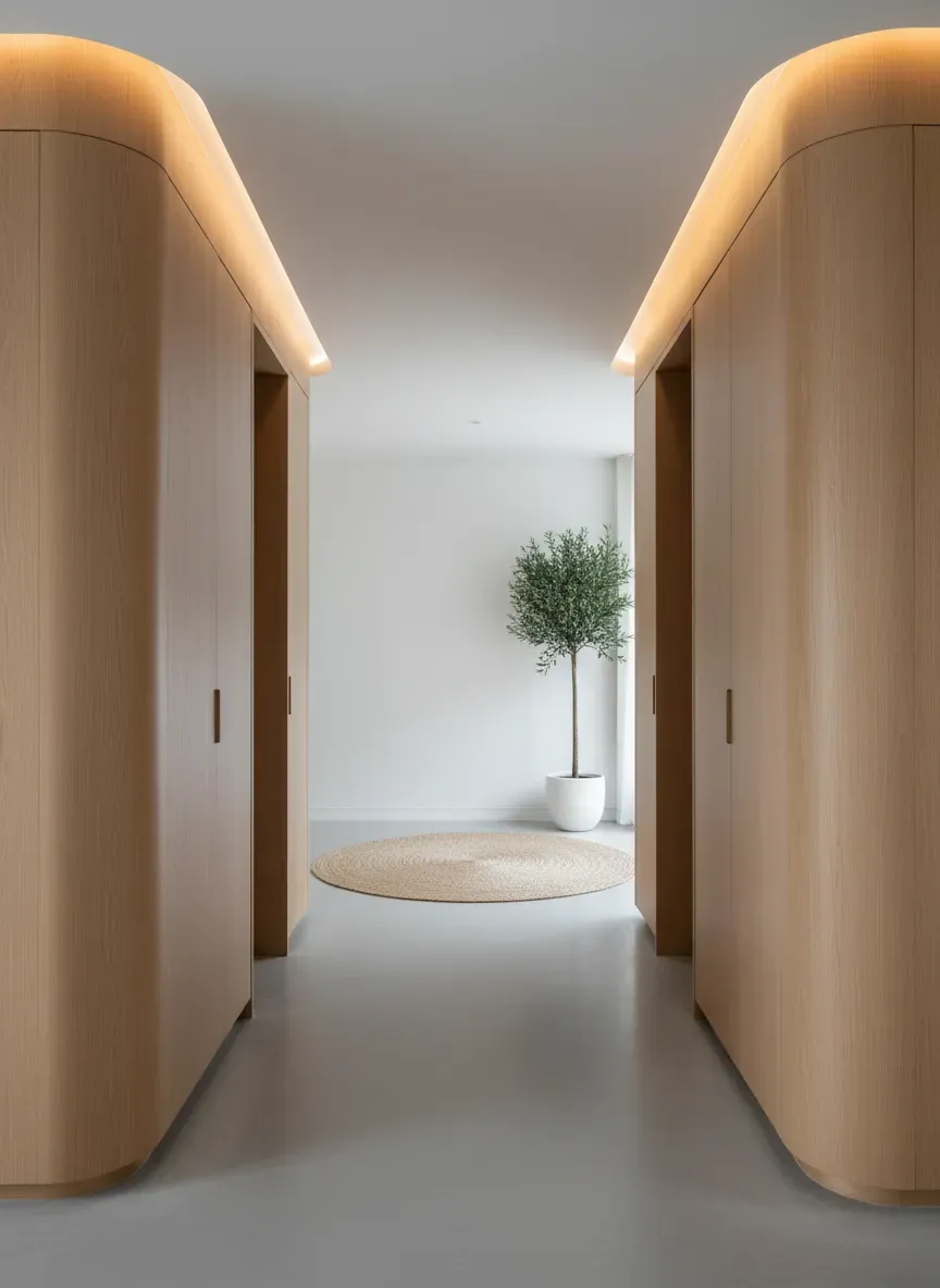
Sharp, 90-degree angles are the enemy of smooth biological movement. When we navigate tight corners, our bodies naturally cut the apex. If a built-in bench or cabinet features a harsh, right-angled corner protruding into the traffic path, it will inevitably become a bruise-generator. Hip-checks against sharp cabinetry abruptly halt movement and create a hostile psychological association with the space.
The solution is the radius edge. By rounding off the external corners of bench seats, shelving, and base cabinets, you soften the physical impact of the architecture. A radius edge allows the human body to slip past the millwork smoothly, effectively widening the usable transit space without actually altering the footprint of the unit. This subtle, organic sloping invites movement rather than aggressively blocking it.
Common Pitfalls in Entryway Spatial Planning
Even with a strong grasp of kinematic theory, it is incredibly easy to fall into certain design traps. I see these mistakes repeatedly in high-end renovations where aesthetic ambition overrides functional reality.
Over-Saturating the Volume: Just because you have a ten-foot wall doesn’t mean you should fill all ten feet with floor-to-ceiling cabinetry. Monolithic blocks of dark wood can make a hallway feel like a suffocating tunnel. You must balance closed storage with “negative space.” Leaving sections of the wall open, utilizing floating shelves, or incorporating a large mirror breaks up the visual mass and gives the eye a place to rest, making the corridor feel expansive rather than restrictive.
Ignoring the Floor Mats: Built-in drawers that sit completely flush with the floor might look sleek on an architect’s rendering, but they are a nightmare in practice. Why? Because entryways require thick, heavy-duty floor mats to trap dirt and moisture. If your bottom drawer clears the bare floor by only a quarter of an inch, it will instantly jam against your weather mat. Always elevate the base of your built-ins by at least 3 to 4 inches to accommodate robust rugs and easy vacuuming.
The Bottleneck Bench Placement: Never place a bench directly opposite the side of the door that opens. If your door swings inward and to the right, placing the bench on the left wall means that the moment someone sits down, anyone entering behind them must awkwardly squeeze between the seated person’s knees and the edge of the open door. Always place the seating deep enough into the home so that the door can be fully closed before the sit-down process begins.
The Final Polish: Lighting and Materiality as Ergonomic Tools
Physical dimensions dictate how we move, but visual cues tell us where to move. Ergonomics extends far beyond tape measures; it encompasses the sensory experience of navigating a space.
Lighting is a potent tool for traffic control. A harsh, single overhead bulb casts aggressive shadows that make small spaces feel cramped and unwelcoming. Layered lighting, on the other hand, guides the eye and the feet. Installing warm-toned LED strip lighting underneath the toe-kick of your built-in bench creates a floating effect that visually expands the floor space. It also serves as a brilliant safety feature, illuminating the floor at night so you don’t trip over a stray pair of sneakers.
Material contrast also plays a vital role in depth perception. If your built-in bench is painted the exact same color as your walls and your flooring lacks contrast, the edges blur. The brain has a harder time calculating the exact boundary of the obstacle, leading to hesitant movement or accidental bumps. Utilizing a high-contrast wood cap on the bench seat clearly delineates the horizontal plane, allowing the brain to unconsciously map the room’s geometry in an instant.
- Key Takeaways:
- Do not rely on standard hallway widths (36”) for entryways; aim for 48” to 60” of clearance in the active drop zone.
- Map your storage sequentially (keys/mail, coats, then shoes) to match the natural behavioral vector of entering a home.
- Soften protruding corners with radius edges to prevent painful hip-checks in tight quarters.
- Respect anthropometric reach zones by keeping daily-use items between 30 and 60 inches off the floor.
- Ensure bench seating has an open base or toe-kick to allow proper heel placement when standing up.
The Bottom Line: You have the power to transform the most stressful threshold in your home into a space of seamless transition. By prioritizing the kinematics of the human body, respecting clearance zones, and deploying clever, slim-profile built-ins, you can eliminate the dreaded entryway bottleneck. True organizational mastery isn’t about cramming more boxes into a room; it’s about sculpting an environment that anticipates, supports, and guides your every movement.