Two-Tone Mudroom Ideas: How to Use Contrasting Finishes for More Style
Discover expert strategies for designing a two-tone mudroom. Learn how to balance contrasting finishes, select durable materials, and elevate your entryway's aesthetic.
Apr 2, 2026 - Written by: Linda Wise

The mudroom is the undisputed workhorse of the modern home. It absorbs the brunt of our chaotic lives—snow-caked boots, dripping umbrellas, mud-spattered dog leashes, and heavy backpacks. Yet, for all its gritty utility, we increasingly demand that this transitional space looks like a feature straight out of an architectural digest. Balancing rugged functionality with high-end aesthetic appeal is notoriously difficult, but I’ve personally found a design cheat code that solves this exact problem: the two-tone finish.
Implementing two-tone mudroom ideas isn’t just about slapping two different paint colors on a wall. It is a calculated exercise in spatial dynamics, visual weight, and chromatic grounding. By strategically using contrasting finishes, you can hide daily wear and tear where it happens most, while simultaneously tricking the eye into perceiving the room as taller, brighter, and significantly more bespoke.
Before we tear down the drywall and start looking at paint swatches, let’s look at a few of the foundational materials that will make your dual-finish project a resounding success.
Quick Comparison: Top Picks
| Product | Rating | Check Price |
|---|---|---|
| Heavy-Duty Forged Iron Hooks | ⭐⭐⭐⭐⭐ | View on Amazon |
| Premium Matte Cabinet Enamel | ⭐⭐⭐⭐½ | View on Amazon |
| Solid Brass Bin Pulls | ⭐⭐⭐⭐⭐ | View on Amazon |
The Psychology and Architecture of Dual Finishes
When you walk into a poorly designed entryway, it often feels like walking into a utility closet. Monolithic color schemes—especially all-white or all-gray—tend to flatten out millwork. Every scuff mark becomes a focal point. But when you introduce a second tone, you instantly alter how the human brain processes the room’s geometry.
Architecturally speaking, humans prefer spaces that mimic the natural world. We like a solid, grounding presence beneath us (the earth) and a light, airy expanse above us (the sky). Translating this to your cabinetry means anchoring the lower half of your mudroom lockers with a deep, saturated color or a rich wood stain. This dark foundation catches the inevitable scuffs from tossed shoes and wet bags without broadcasting them to the world.
Conversely, treating the upper cubbies and the ceiling in a bright, light-reflective tone draws the eye upward. This technique makes standard eight-foot ceilings feel vaulted. It prevents a narrow corridor from feeling claustrophobic.
Visual Weight and the Horizon Line
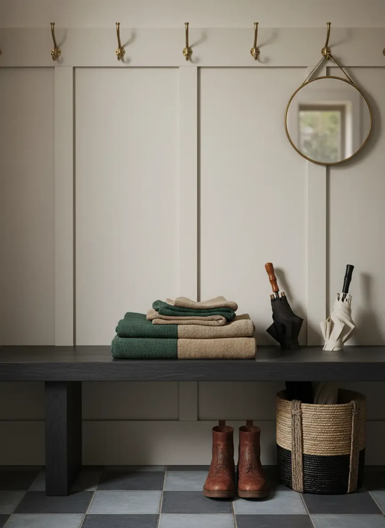
The point where your two tones meet establishes a faux horizon line. Getting this right is critical. If your dark base extends too high, the room feels top-heavy and oppressive. If it stops too low, it looks like a timid baseboard rather than a deliberate design choice. The sweet spot usually lands right at the bench seat or just above the primary hook rail.
Speaking of hook rails, mapping out your vertical space is imperative before you commit to a color split. You need to know exactly how your coats will hang so they don’t visually clutter the transition line. I highly recommend determining the ideal spacing to keep coats from bunching before finalizing your paint heights. A well-placed hook rail acts as a natural border between your two finishes.
Foundational Two-Tone Strategies for Mudrooms
You’ll notice that the most striking entryways don’t rely on random color generation. They follow strict paradigms of contrast. Let’s break down the most effective strategies for pairing finishes.
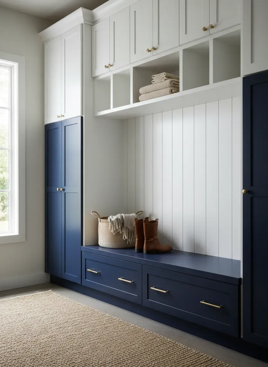
The Classic Light-Top, Dark-Bottom Split
This is the holy grail of mudroom design. A deep navy, forest green, or charcoal gray on the lower bench and shoe cubbies, paired with crisp alabaster or warm white on the upper lockers.
Why is this so effective? Because the lower half of a mudroom takes 90% of the abuse. Vacuum cleaners bump into the toe kicks. Muddy boots get shoved indiscriminately into slots. A dark, durable enamel hides this collateral damage. Meanwhile, the white uppers reflect whatever ambient light filters through your door’s fenestration, keeping the space vibrant.
Wood Tones vs. Painted Cabinetry
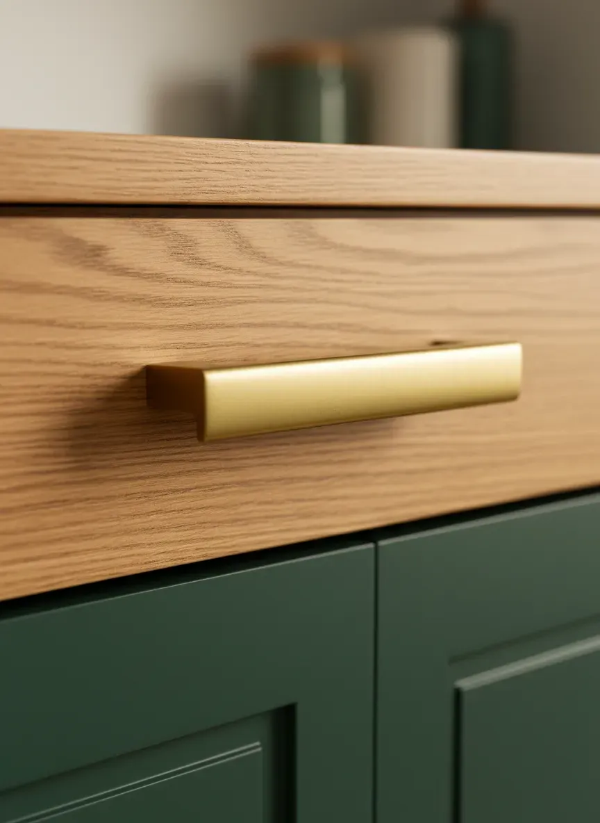
Here’s the real kicker: your second tone doesn’t even have to be paint. Some of the most breathtaking mudrooms I’ve encountered utilize a hybrid approach of painted MDF and natural, stained wood.
Imagine a bank of lockers painted entirely in a soft, muted sage green. Now, slice through the center of that greenery with a thick, solid white oak benchtop left in its natural, clear-coated state. The organic warmth of the wood completely neutralizes the clinical feel of painted cabinetry.
Wood introduces a tactile discrepancy. Paint is smooth and uniform; wood has grain, knots, and history. Using a durable hardwood for the bench seating not only looks incredible, but it also withstands the impact of metal zippers and heavy grocery bags far better than soft pine or painted plywood.
Sizing and Spatial Dynamics
Contrast isn’t just about color; it’s about proportion. A dual-tone approach can either highlight brilliant custom carpentry or expose awkward sizing. Before you order materials, you have to nail down the physical dimensions of the built-ins. You can’t successfully apply a two-tone aesthetic if the underlying boxes are disproportionate.
Taking the time to review a comprehensive mudroom locker depth guide ensures your dark lower bench is deep enough for practical seating, while your upper cabinets remain shallow enough to avoid feeling like they are looming over your head.
Material Selections that Elevate the Contrast
Choosing the right colors is only half the battle. If you want a mudroom that feels like it belongs in a luxury estate rather than a flip house, you have to manipulate sheen and texture.
Matte vs. High-Gloss Dynamics
Have you ever considered painting the bottom and top halves of your mudroom the exact same color, but in completely different sheens? It’s an advanced move that yields subtle, sophisticated results.
A high-gloss finish on a ceiling or upper cabinet bounces light around like a mirror, giving the illusion of immense space. Pairing that with a dead-flat matte finish on the lower cabinets creates a textural friction that is irresistible to the eye.
However, if you’re using different colors, I advise standardizing the sheen to tie the look together. A premium matte cabinet enamel offers a velvety, modern finish that hides brushstrokes and roller marks, making it ideal for the DIYer attempting a high-end look. Just ensure the formula is urethane-fortified so it can withstand scrubbing.
The Role of Hardware as a Bridge
When you severely split a room with two contrasting finishes, you run the risk of the space feeling disjointed—like two separate pieces of furniture awkwardly stacked on top of each other. Your cabinet hardware is the bridge that stitches the design back together.
If you have a dark green base and a white upper, using the exact same unlacquered brass hardware on both sections creates visual continuity. The brass pops brilliantly against the dark green and adds quiet warmth to the white. It signals to the brain that these two distinct halves are part of a unified, intentional system.
Custom Cabinetry and Millwork Considerations
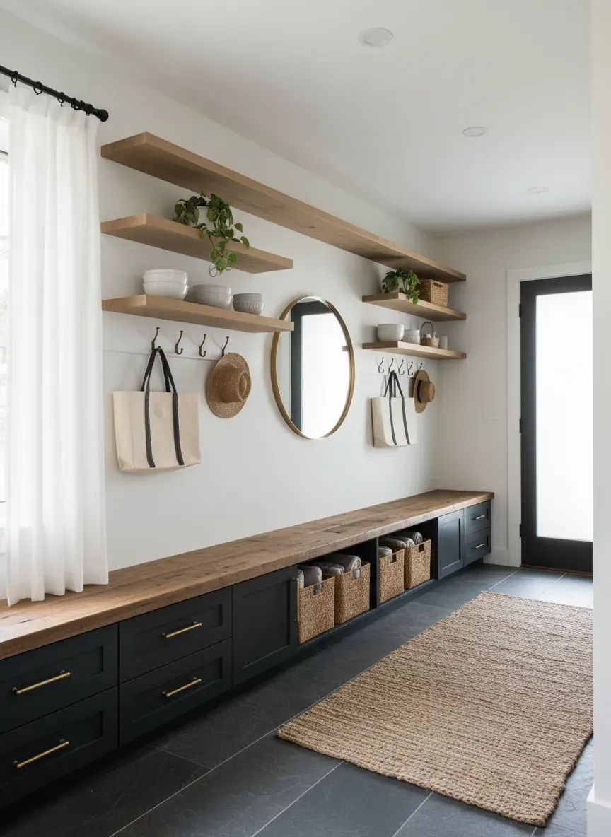
The architectural bones of your mudroom dictate how well a two-tone application will succeed. Standard flat-panel cabinets from a big-box store often lack the necessary physical breaks to make a color transition look natural. You need trim, molding, and texture.
Integrating Beadboard and Shiplap
One of my favorite ways to employ two tones is by utilizing a textured backing inside the lockers. Beadboard is a classic choice. You can paint the main framework of the lockers a stark, modern black, but leave the beadboard backing a natural wood tone or paint it a soft cream.
This creates depth. The eye is drawn into the locker, making the entire unit feel more substantial. It’s a brilliant trick for narrow spaces. Whether you’re squeezing a single unit behind a door or finding the perfect 12-24 inch locker width for a tight hallway, adding a contrasting textured back panel maximizes the perceived volume of the furniture.
Managing Transitions with Trim
You should never let two paint colors meet on a flat, flush surface if you can avoid it. The line will never be perfectly straight, and it will always look like a temporary patch job.
Instead, use physical trim to dictate the color break. A thick benchtop, a piece of horizontal lattice, or a prominent dado rail provides a hard physical boundary for the paint. You paint up to the trim in one color, and paint the trim and everything above it in the second color. This creates crisp, professional lines.
Pro Tip: If you are transitioning from a painted base to a stained wood benchtop, apply a bead of clear silicone rather than white caulk at the seam. White caulk will eventually yellow and draw attention to the joint, whereas clear silicone disappears into the wood grain.
Practical Applications and Real-World Scenarios
Theory is great, but mudrooms are battlegrounds. How do these high-contrast finishes hold up when the kids come home from soccer practice?
Hiding Dirt Without Sacrificing Brightness
Let’s address the most common mudroom complaint: dirt. If you paint a mudroom entirely white, you will be wiping it down daily. If you paint it entirely black, it will show every spec of dust and pet hair, and the room will feel like a cave.
The two-tone method is the ultimate compromise. For high-traffic households, I recommend a medium-dark lower tone—think slate gray, deep teal, or warm taupe. These colors share the same visual frequency as common dirt and dried mud, meaning the mess blends in until you have time to clean it.
To maintain a cheerful environment, the upper cabinets, walls, and ceiling must carry the burden of illumination. Keep them light.
Small Mudrooms vs. Sprawling Entryways
The scale of your room should influence your contrast levels. In a massive, dedicated mudroom with its own exterior door and a window, you can afford high-contrast drama—like pitch black bottoms and stark white tops. The natural light will balance the severity of the black.
However, if your “mudroom” is just a converted hallway closet or a tight nook by the garage door, high contrast will chop the space up and make it feel smaller. For tight quarters, opt for low-contrast two-tone designs. Pair a soft mushroom gray on the bottom with a warm ivory on top. The subtle shift adds custom elegance without jarring the eye or segmenting the small footprint.
Avoiding the Common Pitfalls of Dual Tones
Even seasoned DIYers can misstep when juggling multiple finishes. Here are the traps you need to dodge to keep your entryway looking professional.
Ignored Proportions: The 50/50 Mistake
Never split your room exactly in half. Cutting a wall horizontally at the precise midpoint creates a static, rigid, and deeply unnatural look. The eye doesn’t know whether to focus on the top or the bottom.
Instead, adhere to asymmetrical proportions. A 1/3 to 2/3 ratio is universally pleasing. Either anchor the bottom third in a dark tone and leave the upper two-thirds light, or bring the dark tone up to the two-thirds mark (often right above the coat hooks) and leave only the top cubbies and ceiling light.
Clashing Undertones
This is where perfectly good plans go to die. You pick a gray for the lower cabinets and a white for the uppers, only to finish painting and realize the room feels vaguely nauseating. Why? Because you mixed a cool-toned gray (blue/purple base) with a warm-toned white (yellow/orange base).
Your two tones must share complementary chemistry. If you are using an earthy, warm olive green on the bottom, your upper white needs a touch of warmth—like a creamy linen or a soft chalk white. If you pair that olive green with a stark, hospital-blue white, the two finishes will fight each other aggressively.
When in doubt, test your swatches under the actual lighting conditions of your mudroom. Grab a set of high-quality LED puck lights if your built-ins cast heavy shadows, as artificial lighting will drastically alter how undertones present themselves.
Neglecting the Floor Transition
Your lower cabinet color does not exist in a vacuum; it sits directly on top of your flooring. If you have warm red-oak hardwood floors and you paint your lower mudroom cabinets a cool, stark gray, the clash will be jarring.
The bottom tone of your cabinetry should act as a transitional gradient between the floor and the upper cabinets. If your floors are heavily patterned or textured (like a multi-colored slate tile), choose a solid, understated color for the lower cabinets to give the eye a place to rest.
Key Takeaways for Perfect Pairings:
- Always test undertones: Paint large swatches and look at them at 8 AM and 8 PM.
- Bridge the gap: Use uniform hardware across both finishes to create cohesion.
- Mind the ratio: Never split the room 50/50. Aim for the golden ratio of 1/3 to 2/3.
- Utilize physical breaks: Let trim, bench seams, or hook rails dictate where one color ends and the other begins.
- Balance the sheen: If using different colors, stick to the same paint sheen to avoid a chaotic, fun-house effect.
Bringing Your Two-Tone Vision to Life (The Build Phase)
By now, you understand the “why” and the “what” of designing a stunning dual-finish entryway. The spatial dynamics make sense, the color psychology clicks, and you know exactly how to avoid the amateur trap of clashing undertones.
But there is still the matter of the physical build.
Custom cabinetry—especially perfectly fitted, floor-to-ceiling mudroom lockers that feature intricate beadboard backing and thick hardwood benches—costs an absolute fortune. Local millworkers and general contractors regularly quote upwards of $5,000 to $10,000 for a moderately sized built-in entryway system. And frankly, a large portion of that cost is just labor for assembling basic plywood boxes and face frames.
The Bottom Line: You do not need to empty your savings account to achieve a magazine-quality, two-tone mudroom. If you have access to a circular saw, a drill, and a weekend, you possess the capability to build these structures yourself. The only thing separating a DIYer from a master carpenter in a project like this is having the right set of blueprints.
This is where I highly suggest grabbing a resource that entirely removes the guesswork from custom carpentry. I constantly recommend Ted’s Woodworking to homeowners looking to elevate their spaces. It is a massive, meticulously detailed archive containing over 16,000 step-by-step woodworking plans.
Instead of trying to reverse-engineer a Pinterest photo and messing up your lumber cuts, you can pull exact schematics for mudroom lockers, bench seating, and custom shelving. The plans include precise cut lists, material requirements, and detailed diagrams that make the assembly phase foolproof.
You can build the exact architectural bones required to make your two-tone paint job look like a $10,000 custom install. Here’s the real kicker: right now, you can get access to the entire 16,000-plan database at a massive 75% discount.
If you are ready to transform your chaotic entryway into a stunning, highly functional focal point, click here to get your 75% discount on Ted’s Woodworking plans today. Build the foundation right, apply your contrasting finishes with confidence, and enjoy a mudroom that truly works for you.